Monday, April 6, 2015

Magazines Part II

Early Magazine Covers

Early magazine covers were nothing like todays magazine covers. Early covers sometimes didn't even have a picture on it, and were usually deprived on color in general. They were more book like that anything, and commonly had a table of contents and publishing information rather than an image. If a cover did have a image, it was for more decorative purposes rather than to reflect to the contents of the magazine.

Poster Cover

The poster cover is a more commonly used type of cover in today's magazines. These covers used pictures that took up the entire front page of the magazine. These photos are not usually coupled with words, and are the subject of the main story/ cover story (because its on the cover).

Pictures Married to Type

These magazine cover are more similar to Poster Covers than Early magazine covers. They are composed of a picture or main subject, which high lights the main story. However, the cover photo is often accompanied by a few sub-headings of other minor stories through ought the issue. This is to give an on looker more of an idea of the contents of the magazine.

In the Forrest of Words

Magazine covers of this type are almost a direct combination of early magazine covers and poster covers. Like poster covers they have a giant image centered in the middle of the magazine. But like early magazine covers, they are surrounded by sub-headings almost like a table of contents.

My Favorite Cover


The FADER, April/May 2012: "Philip Glass"

I like this portrait the most because of the creative element of a time lapse. Having the same person on both of the covers of a magazine is something I haven't seen before. This exemplifies how Phillip Glass has been around for a long time, and clearly has created and influence from whenever her was younger to his senior years. I think they used different background colors to better complement his age, as well as maybe signify how he has changed as a composer.

Tuesday, March 31, 2015

Magazine Tips

1. If the cover pops out from its background, don’t weaken it by fussing with it.
2. Arousing curiosity (that’s to pull the casual glancer in)
3. Intellectually stimulating, interesting (that’s to promise benefits)
4. If it is invisible like wallpaper, decide what element is worthy of becoming dominant by enlarging, by isolating, by more controlled color, by more clever wording.
5. Don't judge a cover on a screen because it glows in vivid colors that will inevitably turn disappointingly dull when printed in ink. A hard-copy printout may be closer.

Newspaper Spread No. 2 #2

Wednesday, March 11, 2015

CE 5.2

1. The superintendent says that he could possibly create a 2nd Liberal Arts and Science Academy program at an already existing school in south Austin.
2. Hilary Clinton used her private email for official business and deleted thousands of emails from that email account.
3. The cartoon is poking fun at Hillary Clinton for her recent controversy over using a private email.
4. A micro unit is an apartment around 400 square feet.
5. Kansas, Oklahoma, Iowa State, Baylor and West Virgina are all locks in the Big 12 tournament.
6. I think that the actions implemented by the University were justified by their strict and clear zero-tolerance rules. Free speech is allowed in the United States, but even though you are allowed to say whatever you want, if you are part of and organization or school, based on what you say, schools are allowed to expel you. I think I wouldn't try to stop it, but I wouldn't join in either, if people are racist thats their deal, but I'm not. I don't know if I would record it or not, I would greatly depend on the situation. It made it sound like the entire frat was participating, so I say that it was right to close the entire frat.

Monday, March 9, 2015

Types of Portraits


I like this photo because this guy if amazing. He has checkered underwear, and wears it with pride.


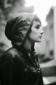
 I like this photo because the light on her face makes here appear very clean.


I like this picture because this guy looks really funny, and seems really serious about pointing at the camera.

1. An environmental photo has some sort of life from above shinning on the subject.
2. Environmental has a background of some sort, while casual portraits are more like stock photos with white backgrounds.
3. Most self portraits are black and white.
4. I will want to shoot in the courtyard if it's sunny out to get much better lighting.